Effective landing pages encourage those who respond to your ads and marketing campaigns to take action. Landing pages can serve a variety of purposes, but they work best when written and designed to achieve a specific goal.
The goal of millions of landing pages is to get visitors to click through. your email addresses.
Are you creating dedicated landing pages for building email lists? This can produce a series of events that serve your marketing purposes:
- You’ll just get more leads. Email capture landing pages offer higher conversion rates than landing pages that require a purchase.
- When people subscribe to your email list, they give you permission to market to them.
- You can design specific landing pages to build targeted email lists. You can use them to create data-driven lead nurturing campaigns with further personalization.
In this post, we look at a variety of landing pages designed to collect email addresses and review leads. tactics some of the best email landing pages employ to increase conversion.
What is an Email Capture Landing Page?
An Email Capture Landing Page email capture is expressly created to prompt the visitor to enter an email address.
Think of it as a transaction. Your landing page displays a specific offer, something the visitor finds valuable, (usually) for free in exchange for an email address. Lead generation landing pages include a form or serve one quickly to visitors when they click to indicate they are interested.
Digital marketers tend to create a variety of offers, often called lead magnets. As described in this post, lead magnets can include a subscription, guide, research report, video, webinar, mini-course, tools, coupons, bonus offer, and more. In the examples below, you’ll discover useful lead capture strategies and how they’re applied to email capture landing pages.
Helpful tips for creating an email capture landing page
Post an efficient page
The popular advice is to keep your landing page short. However, the perfect copy length is directly related to what it takes to get a response. So instead of making it short, make it as short as possible. It’s worth testing the length of your page and the details you include.
Design a clear CTA
Write an action-oriented call-to-action (CTA) that presents a promise . Make your button stand out, clear, and easy to find.
Write Compelling Copy
Although your offer is probably free, sell it with copy that highlights the benefits of responding. This guide can help with that.
Includes social proof
People follow the crowd and trust the authorities. Feature social proof tactics on your landing page, such as awards, praise, testimonials, reviews, or any other evidence.
Request only what you need
Keep your forms short, if possible . A general rule of thumb suggests that the more fields you fill out on your form, the fewer responses you’ll get. However, if the goal of your campaign is to nurture leads with targeted communications, consider asking optional questions and making it easier to select answers.
Show the offer
The The The lead magnet you offer is meant to be digital. Create an image that helps the visitor anticipate what they will get, it is likely to lead to higher conversions.
10 Email Capture Landing Page Examples
1. Close
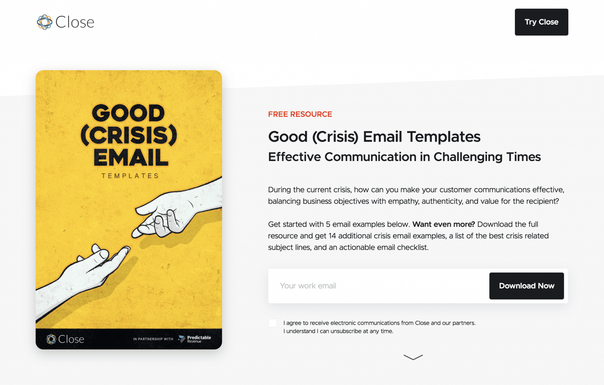
Let’s start with an example landing page design that offers an attractive lead magnet. This home page from Close, a company that offers a CRM platform for startups and SMBs, deliberately showcases the offer and features a single email field at the top of the page. The page continues with a short video, six examples of what the downloadable resource offers, and closes with a free trial offer. It focuses on getting the visitor to provide an email address to download the collection of templates on offer.
2. IFTTT
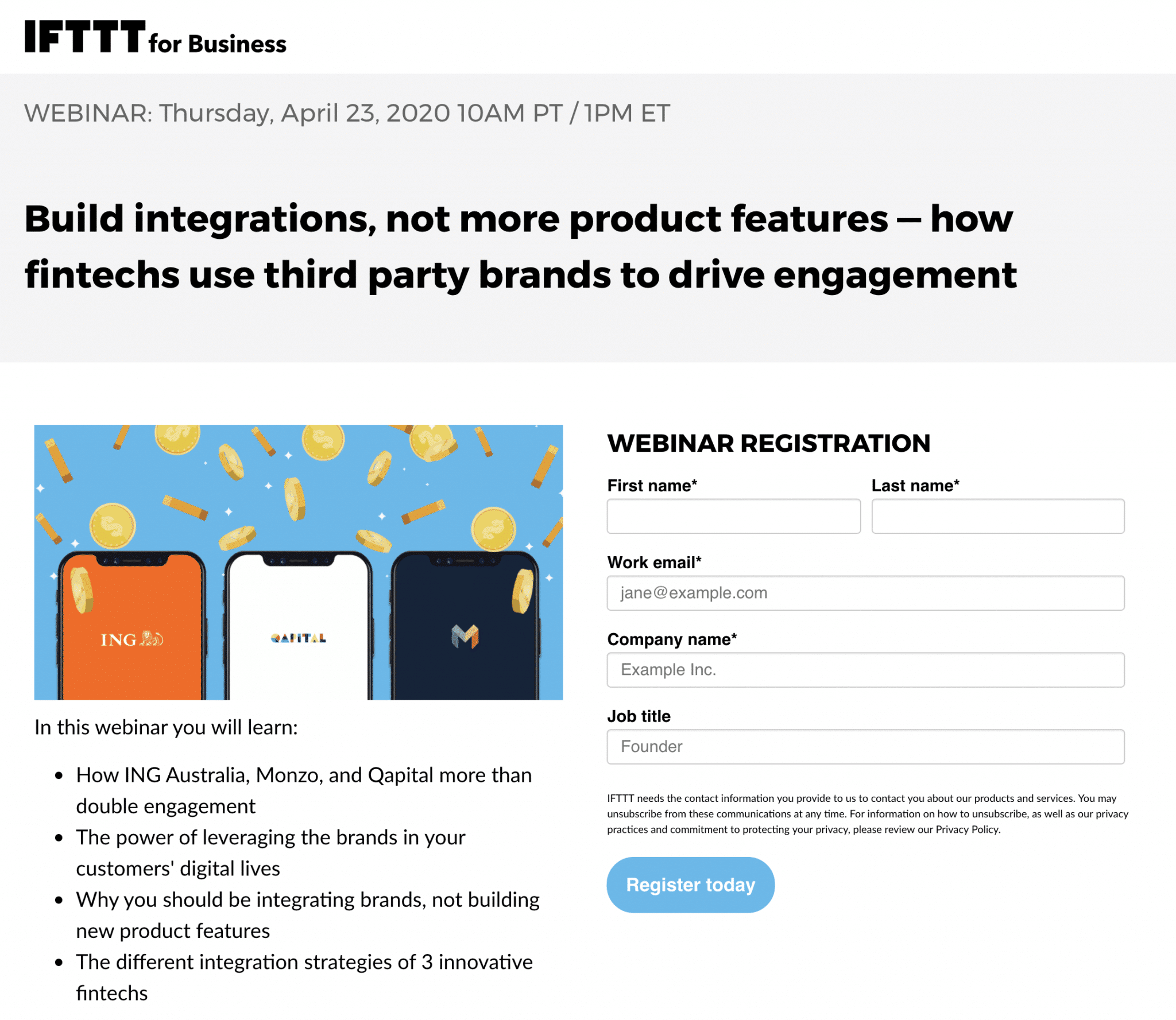
Creating and promoting webinars is a popular and effective way to grow your email list and reach new potential customers. I reviewed a number of landing pages for webinar registration. I chose to share IFTTT because, unlike many of the others, it refrains from including a menu or links that take you somewhere else. The success of this campaign is measured by the number of registrants. The page’s singular focus and call-to-action (Sign Up Today) help achieve this goal.
Another nice touch is the short four-bullet list of what you learn in the webinar. Apply this tip to any content you promote with email capture landing pages.
3. Designli
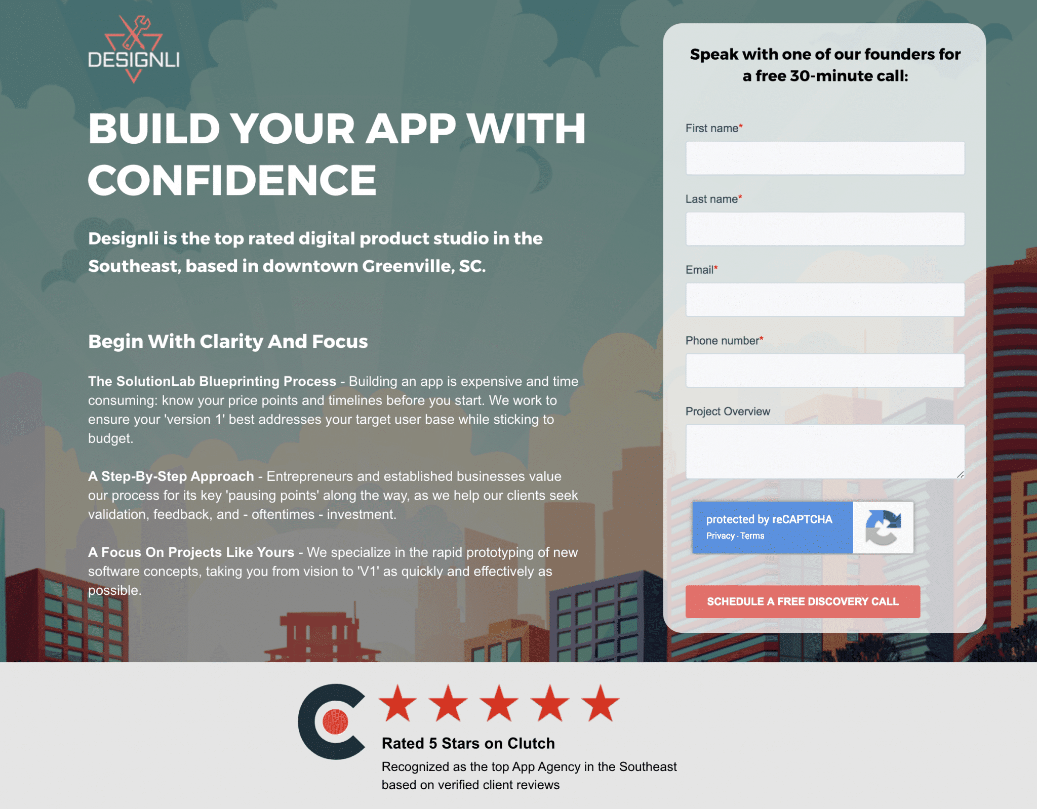
The offer here is simply a consultation call, but kudos to Designli for nailing this email capture landing page with A number of best practices:
- No distractions : Like the IFTTT landing page, this page has no navigation menu or unnecessary links.
- Action-oriented — A strong, action-oriented headline provides a clear value proposition.
- Simple form — The form is elegantly at the top of the page, again, with practical language.It begins Talk to… and ends with a button reading Schedule a free discovery call.
- Social Proof: Before I have to scroll, Designli makes sure I know you have a 5-star rating on Clutch When I scroll, I find Enter customer testimonials and an additional button to Request a Free Call.
4. Stitch Fix
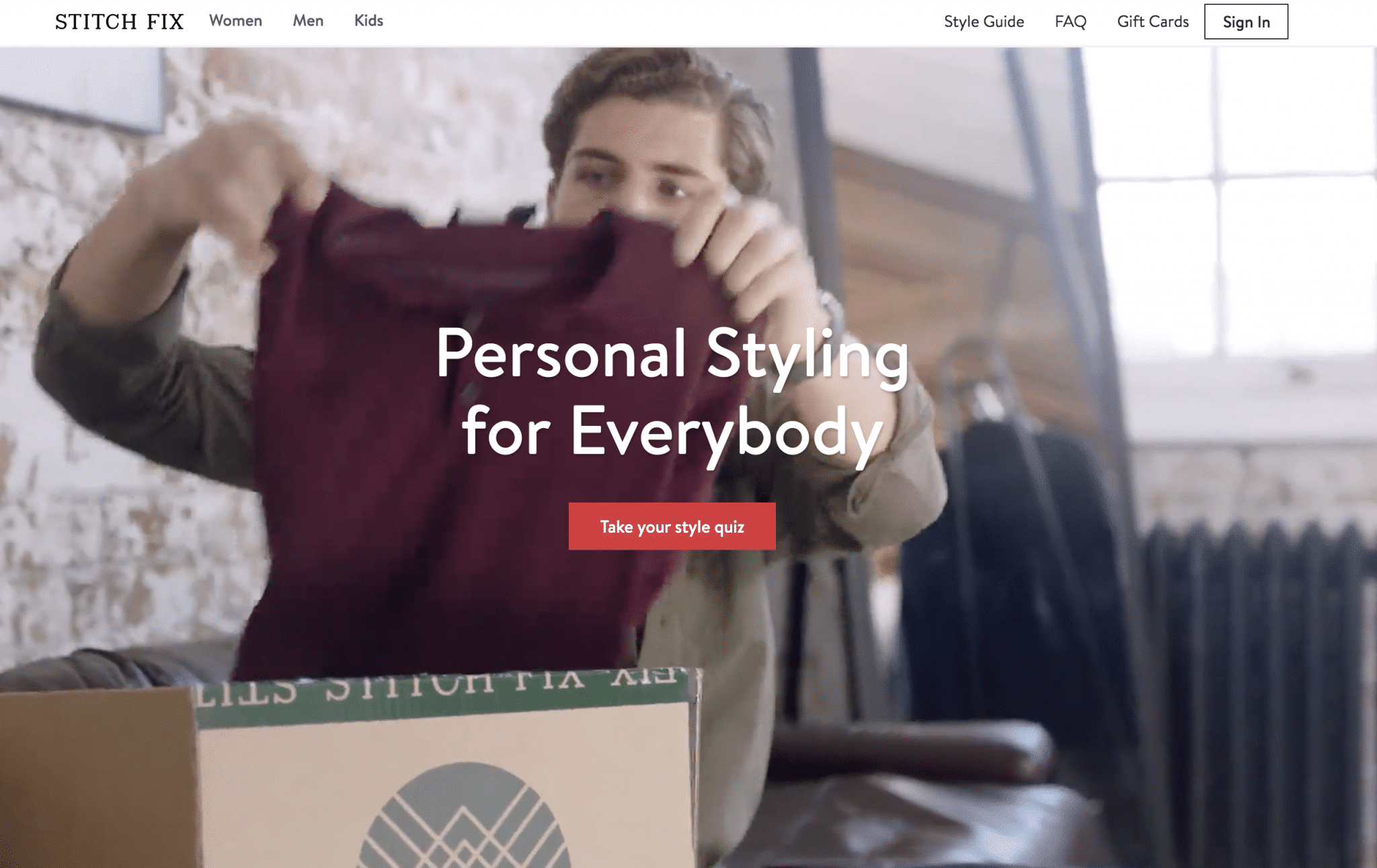
Do you want Stitch Fix to pack and ship you clothes that are likely to fit you and match your tastes? It’s ready to go, but only after you take your style test, which of course requires submitting an email address.
Yesterday, I purposely gave them just enough information to know I am a man who dresses casually. I received this email today:
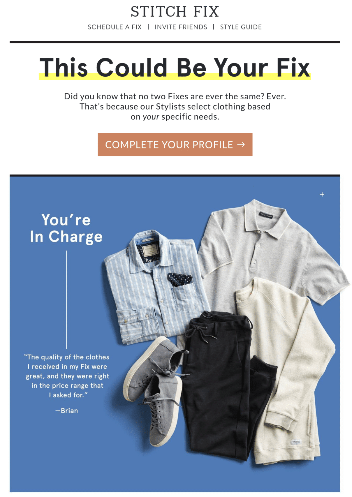
Stitch Fix demonstrates his understanding of lead nurturing here. He personalizes my email with the information he has about me and, in a fun and non-aggressive way, invites me to fill out my profile.
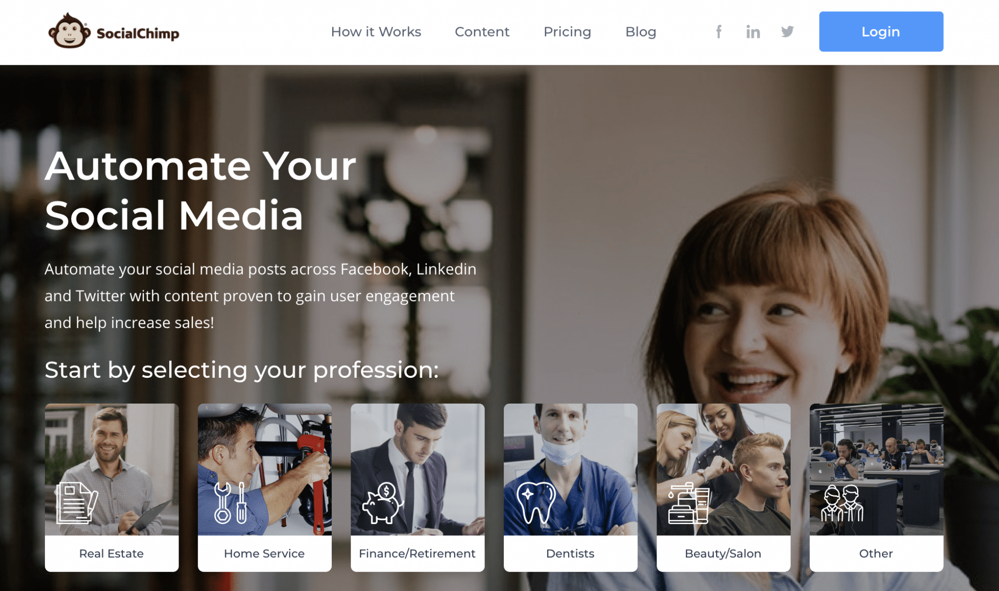
5. SocialChimp
 /p>
/p>
The first thing I like about this SocialChimp home page is its simple title that looks a lot like the ad I clicked on. This basic tactic helps assure visitors that they landed on the correct page. Learn more about writing landing page content here.
This landing page also shows a clear intent to build targeted lists. As you can see above, the company’s platform serves six vertical markets. When you click the button that best relates to your business, the email collection process begins and the Professional field is auto-populated. It’s fair to assume that your lead training process will include industry-specific advice.
6. GoodRx
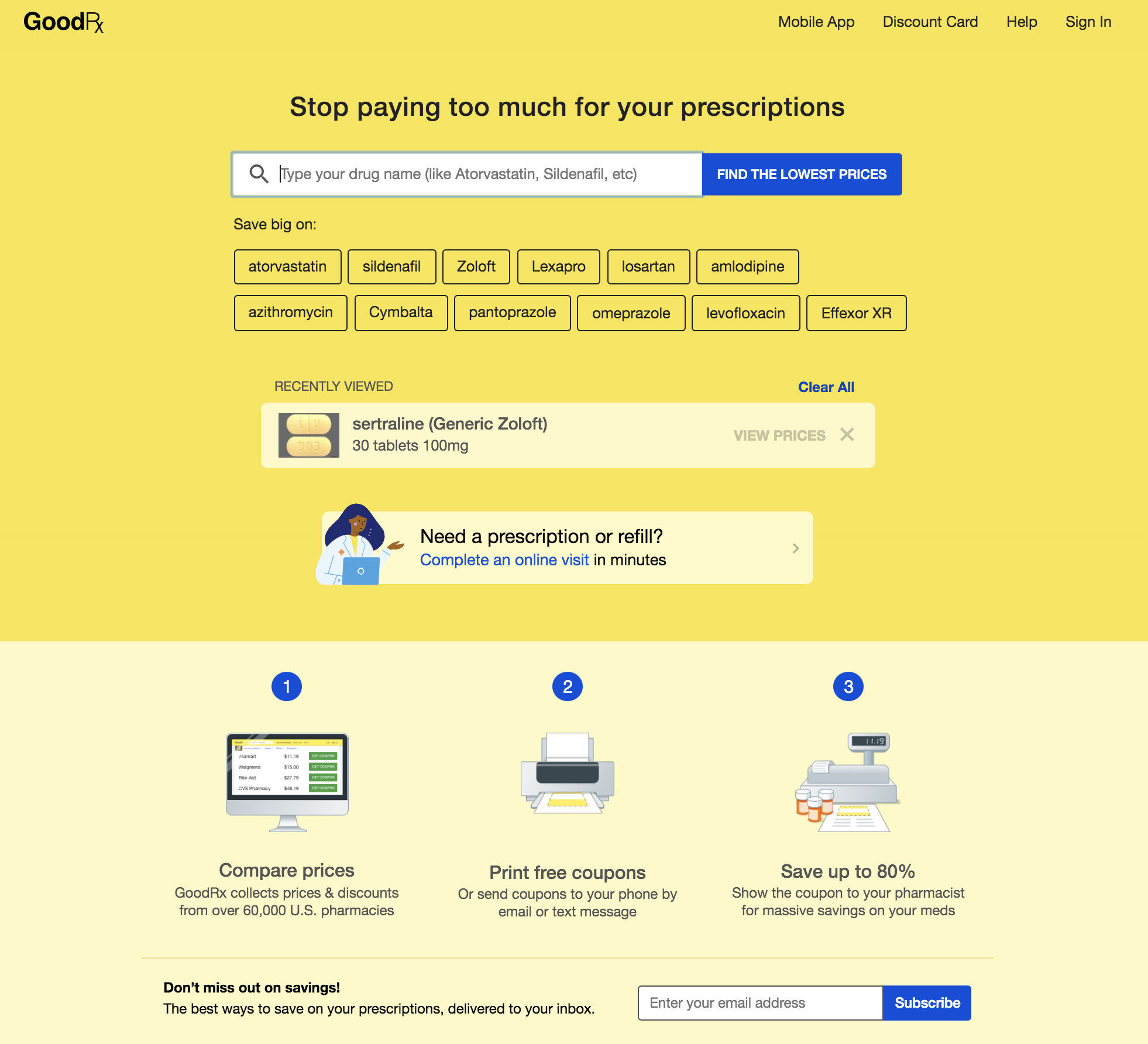 There’s a lot going on on this GoodRx home page, but the company makes its sales pitch clear from the start with a well-written, value-based headline and a simple tool that instantly demonstrates the value of its service. The page then provides a quick 1, 2, 3 explanation of how it works and asks for my email address.
The GoodRx home page covers many bases by also offering an explanatory video, app free , discount card, and a sample savings comparison chart. The page elements, however, are cleverly arranged and the bottom line is, well, I’ll show you… 
Learn more about designing effective landing pages.
7. Salesforce
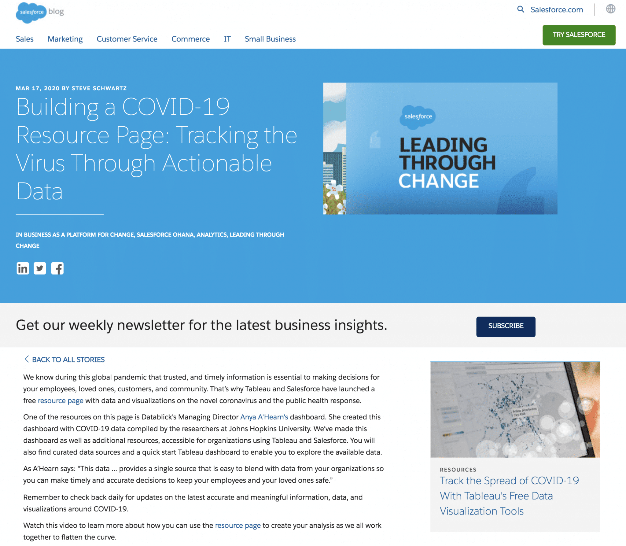
This is interesting, clicking on the Salesforce ad leads to a blog post, which is probably not the highest converting tactic the company can offer. My opinion is that Salesforce recognizes that the decision to invest in their software will be slow and considered, so positioning the company as an authoritative voice is paramount.
As you can see, the page of destination offers the option to subscribe to the Salesforce newsletter, a very ‘soft sell’ lead magnet. If you were to view the full landing page, which includes a video, news, and related posts, you would discover that the landing page is actually a resource page.
However, at the top of the page is an offer to Try Salesforce. Clicking the button invokes the following no-nonsense home page and an extensive free trial of your Essentials platform.

8. Firstleaf
You might recognize this Firstleaf landing page from our recent post on single product landing pages. This landing page is a letter from the founder of the company. He tells a short story about how you can get great wine for less. Your main CTA is for you to order your first shipment.
I’m sharing this landing page again, because it’s also an email capture landing page.
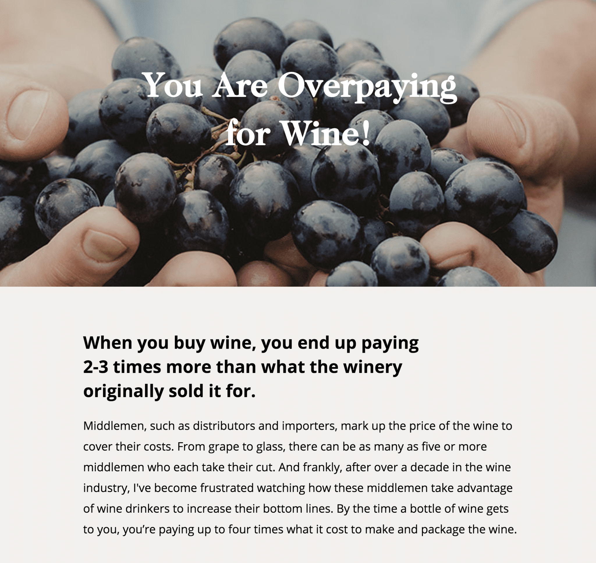
Notice near the bottom of the page for an Plan B emerges Firstleaf recognizes that if you’re not ready to order, you can provide your email address to receive: “best wine recommendations at the best price.” Smart. Salesforce landing page the plan was information first, product second, Firstleaf’s is the reverse.
9.Lucidchart (A)

I find the top of this landing page interesting, not because of its design or headline, but because of its CTA, which says: Make a diagram.
- First, writing your CTA as a command or directive is effective, especially when it’s so specific.
- Second, the prominent Make a diagram CTA on page Destination ina instructs visitors to start with the most important feature of the platform, a clever tactic. e in a free trial.
- Third, the landing page as a whole is dense (bordering on exaggeration), a beast similar to a home page, so it’s wise to aim for conversion from the beginning.
10. Lucidchart (B)
Lucidchart, again? Yes. Check this out… While I was clicking and browsing email capture landing pages, I saw another ad from Lucidchart and clicked out of curiosity…

The company is running a completely different campaign in parallel. This pull is an ‘8 step’ guide. Your offer is the same, but it’s presented differently.
What we see here is an A/B test. The two Lucidchart campaigns may produce very different results. If they do, you might kill the loser and face the winner with another variation.
Here’s how to optimize your campaigns for conversion—one big final lesson. So, go ahead and set up simple and compelling email capture landing pages and convert.
Further reading
.