For many designers, Illustrator is the go-to software for logo design. This industry-standard software makes it easy to design stunning logos for any industry, any style, and any medium—print, video, or digital. Whatever you want to dream up for your Illustrator logo, you need to know how to bring it to life.
Logos communicate brand values through color and shape. It’s where the verbal becomes visual, and the stronger that visual mark is, the stronger the message will become! Whether you’re a first-time Illustrator user or a seasoned pro, I’m here to help you create a logo in Illustrator step-by-step.
A beautiful Illustrator logo design is in your future. So, grab yourself a drink and let’s take a look at what we’ll learn.
1. Start with the creative brief2. Find your keywords 3. Draw your ideas4. Refine your work5. Get customer feedback 6. Digitize your sketch7. Add text8. Add color9. Present your logo10. Export Final Files
How to Make a Logo in Illustrator —
1. Start with the Creative Brief
Before you open Illustrator, you need to have a well-written brief from your client. Without it, you’ll be wandering in the dark trying to guess what the customer wants.
Start by asking questions. And remember, you can never ask for too many! Here are a few to get you started:
- What does the business do? Who is the brand targeting?
- What is the history of the company? Does the name have any deeper meaning?
- What are the brand values?
- What types of design and visual trends appeal to your customer?
Make sure you maintain open communication with your client. And don’t forget that you are the professional, and it is your responsibility to advise the client and point them in the right direction on their design.
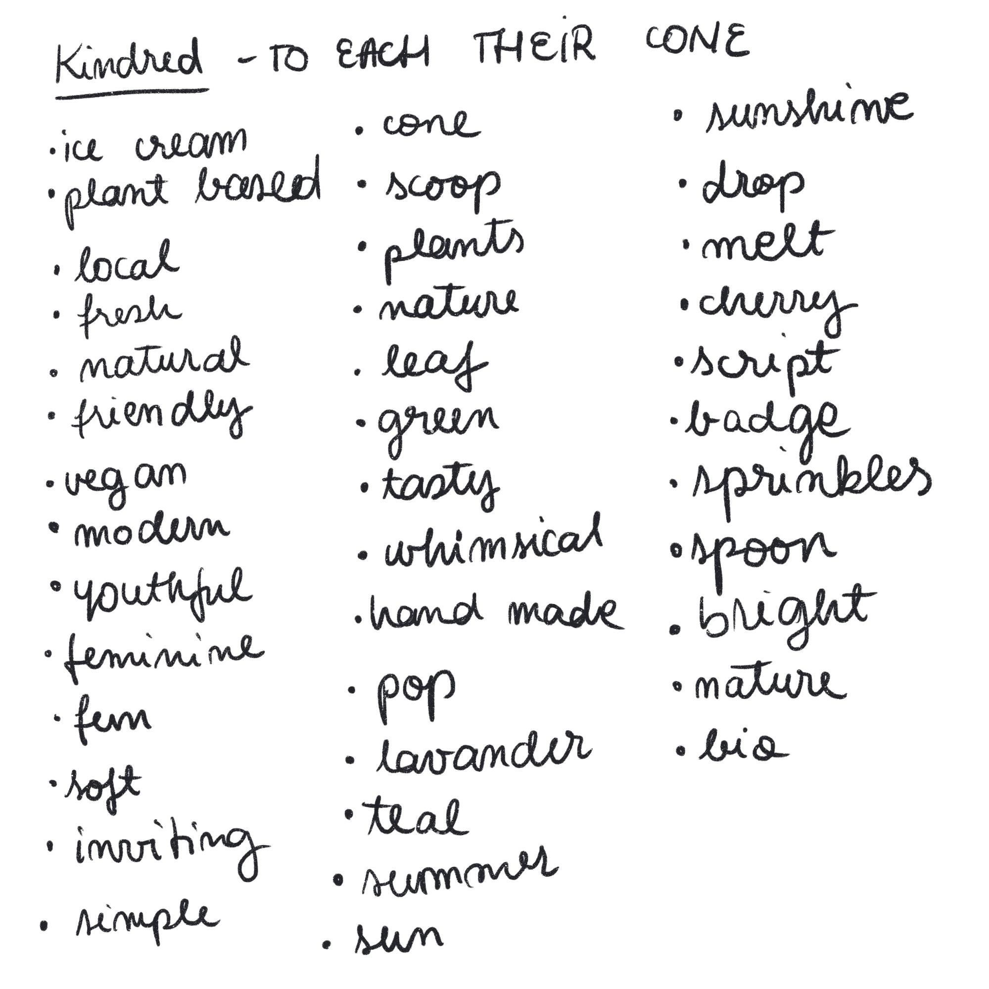
2. Find your keywords
Once you have all the information you need from your client, you can turn it into a logo that works!
Start by making a list of all your keywords relevant to the project. Write down every word that comes to mind when thinking about the brand and don’t worry about making sense or creating something beautiful. You’ll never show this to anyone anyway!
3. Sketch Your Ideas
Now, use your keywords for inspiration and start sketching. Take your customers’ requests into account, but don’t be afraid to go off the rails a bit and try something different if you feel you have a solid reason to.
At this stage, don’t think about drawing” pretty”. Draw quickly and don’t overthink it. Focus solely on getting the ideas out of your head onto paper. You should outline as many ideas and concepts as possible.
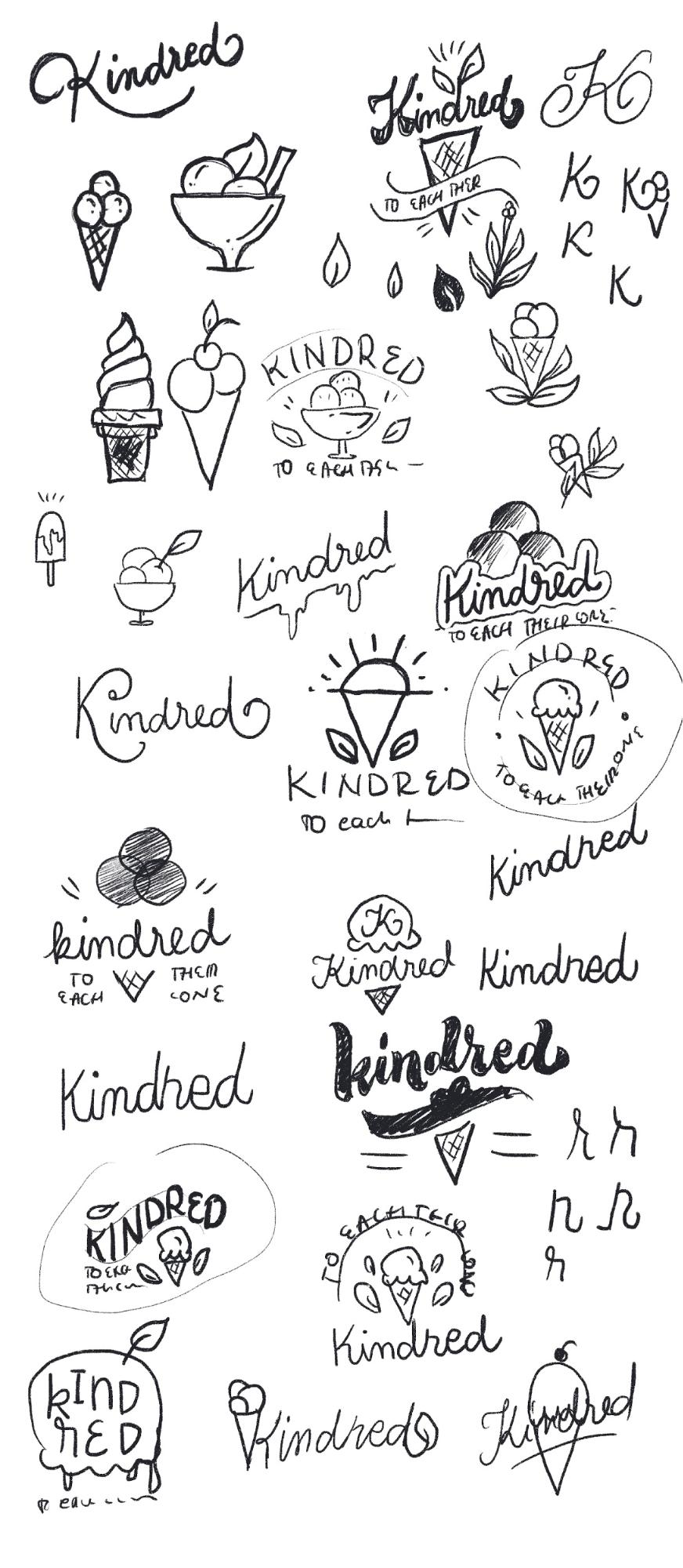
When you feel like you’ve exhausted all the ideas, put the paper aside and leave it until the next day. Sometimes it is necessary to take a step back and see the sketches with new eyes. You may catch bugs you didn’t see, get new ideas, or even see new potential in concepts you didn’t see before.
4. Refine Your Sketches
Take a look at all your sketches again, this time with a critical eye. Look for bugs, find ways to improve, and pick your favorite parts. Then pick a few sketches that you like best and do them over and over again. Drawing the same thing multiple times seems like a waste of time, but it’s actually very useful. Each version will get better and better, and you can draw the perfect version on your 10th try!

As you draw, keep the things you like and review them yourself. more and more effort into each sketch, perfecting them, but don’t get too hung up on the little details. We’ll refine them once we get the image into Illustrator.
5. Get customer feedback
Select your best sketches to send to the customer. We recommend submitting 2-3 initial concepts, but that is up to you and what you have agreed with your client before starting the project.
Send only black and white sketches in the first round. Adding color gets people focused on that, and at this stage, you’re just looking for concept approval.
Don’t forget to also submit a detailed description of your concept sketches. Talk about your ideas and why you chose to work with those specific concepts, shapes, elements, and compositions.
6.Digitize Your Sketch
After your client chooses the one they like best, it’s time to bring their concept into Illustrator!
Depending on the aesthetic you want to achieve, there are a few different ways to make a logo in Illustrator: live tracing in Illustrator after drawing by hand on paper or in Photoshop, or drawing with Illustrator’s Pen Tool.
None of these techniques is better than the other , but one of them will be best suited for your current project.
Option 1: Live Trace
This is an easier technique: draw by hand first, then live trace it with Illustrator.
Open your favorite drawing application (like Photoshop) or get your pen and ink ready. Draw your logo as accurately as possible. Use black or a dark color to make it easier to trace in the cleanest way possible. Remember, this is no longer a sketch, but the actual logo!
Using this technique will give your logo a handmade feel. Your logo will appear a bit jerky and organic. Check your keyword list again to decide if this look would fit your project!

When you are happy with your drawing, open Illustrator and create a new CMYK document . Import your image by clicking FileWhen you’re ready, expand it again, click Image Trace, select the Silhouettes option, and adjust your threshold level.

Notice how smooth they are turned the edges? This makes the whole logo friendlier and more organic!
7. Add Text
Now that you have your logo just the way you want it, it’s time to add your tagline, if you have one. There’s no proper place to put the tagline, but perhaps the simplest thing to do is to add it below the logo in a clean font that matches the style.
For our example, we’ll place it above the logo. in a curved path to close the composition and make it look a bit like a badge.
Start by creating a line or shape that provides the path for the tagline. Then click the Write tool on a path and click on the line itself. So, start writing! Center the text and scale it to fit as desired.

When choosing a font, find one that fits and complements your illustration, and make sure the two don’t compete with each other. Your image should feel harmonious. Be open to trying serif, sans serif, or script fonts, as well as the latest font trends.
If your logo design project is a word mark, a type of logo design that contains only the name of the brand, you will have to express the values and aesthetics of the brand only with the use of typography. In this case, be very careful with your font choices because the characters themselves will carry a lot of meaning and personality. Pay attention and play with contrast, spacing, and weights. Combine multiple letterforms, add subtle meaning to some letters, or add a container or separator of some kind. Modify the letters by removing or adding them, or even create your own new set of letters.

Notice how each version of these has a different mood and expresses different emotions? As you work with wordmarks, find letterforms that are super expressive with an aesthetic that is closely related to what the mark does.
8. Add Color
When you start adding color, make sure the colors you use make sense for the brand. Start by learning a bit about logo colors, color theory, and color trends, and then select color combinations that complement each other. Great logo colors should stand out, but they don’t always have to be overly saturated. You can have great contrast using just pastels.
So how exactly do you go about adding color to your logo?
First, select the elements that need color. Then click the Shape Builder Tool and hover over the spaces that need color. If it’s a closed path that can be turned into a shape, you’ll see a light gray fill color.

Once you have created all the shapes, you can start playing with colors! Start by grouping together all the elements that will have the same color. This will make it easier for you to change colors later. Then, select all the elements you want to change, click the Recolor Artwork feature in the toolbar, and start adjusting the color values.

In our example, the client specifically mentioned that they would like to use lavender and mint…

…so I created a beautiful palette of pastel colors based on that direction.
9 . Present your logo
When your logo looks perfect, create a good presentation for your client. Be sure to show each iteration of the logo, including the different color versions. Remember that each version of the logo shown in the presentation will need to be provided to the client!

You don’t have to go crazy with the presentation and the use of tons of mockups and fancy effects. Keep it simple, clean and clear.
10.Export Final Files
Having a great Illustrator logo design is not enough. You also need the correct files to use the logo on multiple media. So be sure to send your client all the files they may need. Typically, that includes horizontal and vertical versions, as well as full-color, black-and-white, black-only, and white-only versions of each.
For each logo iteration, you’ll want to export these 7 files:
- Illustrator file in CMYK and RGB color profiles
- EPS file in CMYK and RGB color profiles
- SVG file in RGB color profile
- PNG file (with transparent background) in RGB color profile
- JPG file in RGB color profile
To change the color profile (CMYK for print and RGB for web), click File