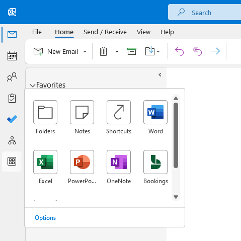
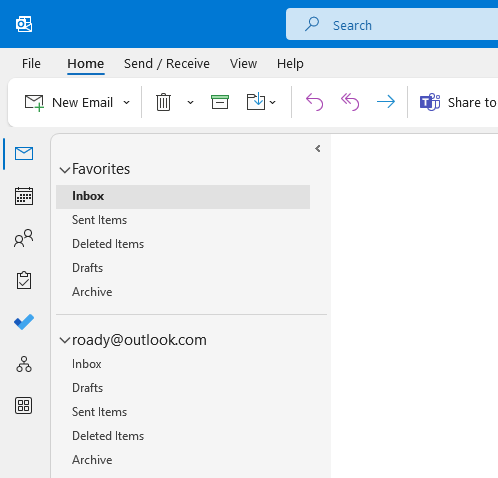
This new navigation and “app bar” layout and placement offers a few more options, but perhaps a lot more mixed feelings.
This new location has become the standard on the current channel since version 2207, which started rolling out the second week of August 2022. Other channels will also get it depending on their release schedule.
 The new Navigation & App Bar on the left of the Folder List in Outlook.
move navigation bar & app bar with coming soon
to move the navigation pane & application bar between the left side of the folder list and inside the folder list, you can currently no longer use the coming soon button in the top right corner of outlook.

Because this feature has become the new default feature, the coming soon button now either controls a different new feature or is no longer available to you. Until Microsoft considers another change, the Navigation & the app bar will stay on the left.
It has not yet been announced when this new location will become the default for the other release channels, such as monthly and semi-annual, but deployment updates will be released with the id. Microsoft 365 68205 roadmap feature.
quick fix:I don’t see the coming soon button, but the navigation button & is the app bar on the left? restarting outlook a couple of times in the next few hours usually fixes it. otherwise, start outlook in safe mode to reset the dropdown flags and force the navigation buttons back to the folder list (until it becomes the default).
Update: Now that this feature has become the default, the previously posted workarounds don’t apply either.
new behavior and keyboard shortcuts
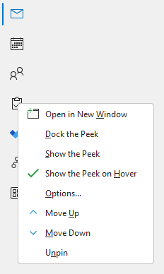
In this new location, you cannot move or unpin the Mail and Calendar modules, but you can add, remove, or change the order of all other modules that are listed.
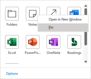
To do this, simply right-click on any of the icons and use the context menu’s raise, lower, unpin, or pin commands.

 The context menu of the Navigation & App Bar and its flyout allows you to Unpin and Pin modules and apps.
keyboard shortcuts for modules are now based on the order they appear in the “application bar”.
since the mail and calendar modules are locked, they still have the keyboard ctrl+1 and ctrl+2 respectively. however, ctrl+6, for example, will no longer necessarily take you to the folder list navigation.
another important change is that microsoft now offers to integrate with outlook when you sign in to the office using an outlook.com account or online exchange.
in addition, when using an online exchange account, it also adds a link to the organization’s browser in the navigation & appbar and it is no longer displayed on the ribbon.
Slightly more controversial is the addition of links to the desktop versions of word, excel, powerpoint, and onenote, as well as links to yammer and booking.
The links for yammer and bookings now also open within the outlook window, providing a seamless experience, but they are basically their web app versions.
Unfortunately, you cannot add links to other applications and websites yourself; not even microsoft teams.
Bonus Tip:Do you find yourself clicking on the flyout in the Calendar, People, or Tasks module a lot? you can disable this flyout by right-clicking on the module and unchecking; show glance on hover.
why this change?
One of the reasons for this change is to bring the layout more in line with the rest of the office layout, such as office.com, outlook on the web, and microsoft teams, which all have an “application rail” to the left.
also, although many people are already used to it since it was introduced in outlook 2003, having the “modules switcher” at the bottom was also actually a poor design choice;
- Usually, you primarily interact with your favorite folders, the ribbon, and email messages at the top of the screen.
- To switch to your calendar, contacts, tasks, etc., you had to go to the bottom of the screen and do a “precision click”.
- then, most of the time, you had to go right back to the screen to interact with your elements. the folder or create a new item.
fun fact:until outlook 2002/xp, you could enable the outlook shortcut bar which also placed a similar navigation style to the left of the folder list. it even had a “my shortcuts” and “other shortcuts” section where you could add links to other apps, websites, and even files. It seems that we have come full circle again.
personal thoughts
I definitely found this new design quite awkward at first, but now I really like it.
Sure, I’m definitely still in the habit of looking down or even scrolling down when I want to switch modules, but the number of times I do that is going down.
at first, I also had occasional “misclicks” to open the files screen (behind the scenes) and ended up clicking the mail module icon instead; having the file command in the upper left corner is very common in all windows applications.
with that in mind, it might actually look and work better when placed below the ribbon and at the same height as the folder list.
 Concept with the Navigation & App Bar below the Ribbon.
call to action!if you prefer the navigation function & the app bar will also show below the ribbon, click the “coming soon” button on the top right corner to open the coming soon panel. at the bottom of this panel, you can click the yes/no button which opens the option to provide additional feedback.
At this point, it’s a limited side benefit for me and I can’t help but feel like it could be (ab)used to advertise lesser known/used microsoft 365 apps. in that case, I’d judge it as a bit of wasted space.
on the other hand, it’s great for future extensibility and some of the early additions are useful. For example, it is now easy to replace/augment the task module with microsoft to do. plus, the new organization explorer found a nice place there too instead of being just another hidden button amongst all the other buttons on the ribbon.
It could also create the opportunity to add more or publish enterprise applications through admin controls in the future, as is done in Microsoft Teams. And speaking of teams; again, why is there no link to microsoft teams?
Overall, I think this “app bar” concept makes the most sense for office and outlook in web apps, as it then acts as a web-based start menu for microsoft 365 apps. desktop, applications are already displayed in the windows start menu and web-only application links can be easily added to the start menu or taskbar by installing them as an application through your favorite internet browser.
more directly; I wish they would only add links for apps and modules that are relevant and work within outlook similar to bookings and organization explorer. adding links to word, excel and powerpoint was also a mistake. With that in mind, I no longer need a link to Teams, but I do want one for Sticky Notes to replace the Notes module.
As you can see, this change really stirs up mixed feelings and raises more questions than answers at the moment. oh, and add another vertical panel to outlook;
- application bar
- folder list
- message list
- reading pane
- to-do bar
hopefully the last 😉
